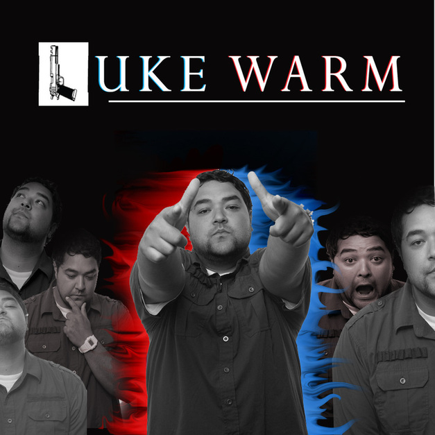
Assignment one for Media 110
Cosmic
Cipher
Ocean
Rage
Thought
Cipher
Ocean
Rage
Thought
Assignment two Media 110
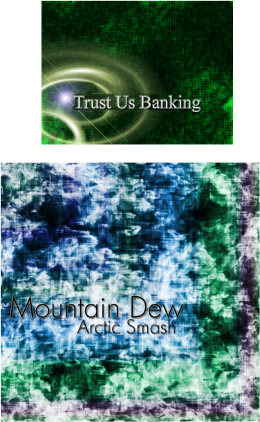
I used Green and Gold for the obvious reason because it represents money and wealth, I like greeen alot because it also represents nature. The hints of yellow represent fast service which is what I always hope for when I have to enter a bank. I chose the second tutorial because I like the rough texture.
I thought this looked like a soda add, the greens and the blues made me kinda want
a Mountain Dew so I went ahead and created a flavor that was fitting to the
background. The blue is for the professional aspect of it and the red represents the
strength of the product. The green because Mountain dew is synonomous with the
color green.
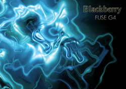
I chose blue for the proffesional aspect and kept it real simple to the left of the document so the words would stand alone and be more legible. The graphic itself just seemed to be right for technology, I named the phone fuse because I thought it was a good title considering the background. I only used one color because I just wanted it to be bold but simple.
Assignment Three Media 110
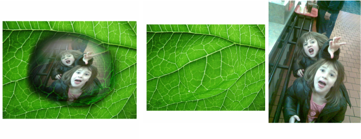
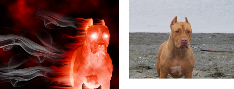
I could not get the sharp edges that a lot of the tutorials had, because of a setting that I could not quite figure out. With that said I did the best I could, I think the images came out pretty cool. The image on the right is the first step in the tutorial. The second image is of my nieces because they are crazy funny and adorable.
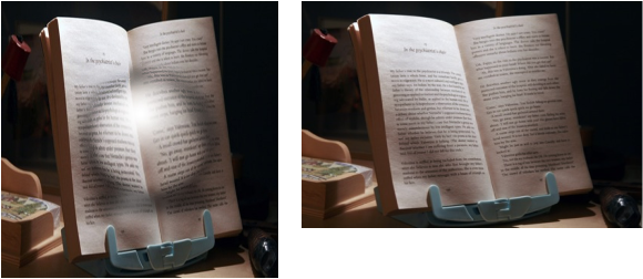
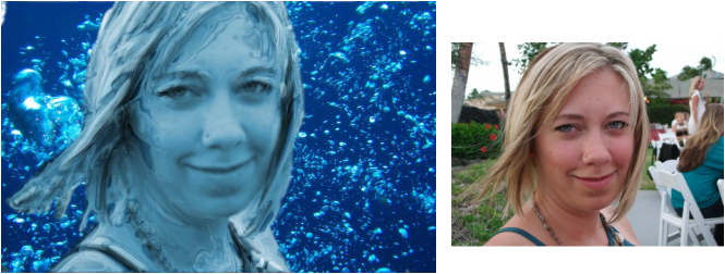
Looks more like a crystal ball then water, because there was a filter or option stuck on that would not give me the crisp edges.
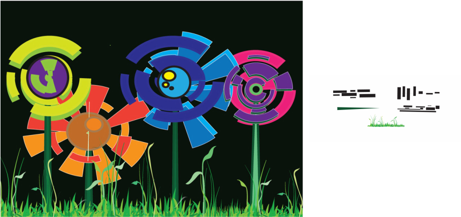
Assinment 4 Media 110
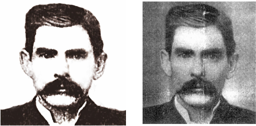
Doc Holiday
Assignment 5 Media 10
Assignment 6 Media 110
Assignment 7 Media 110
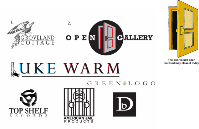
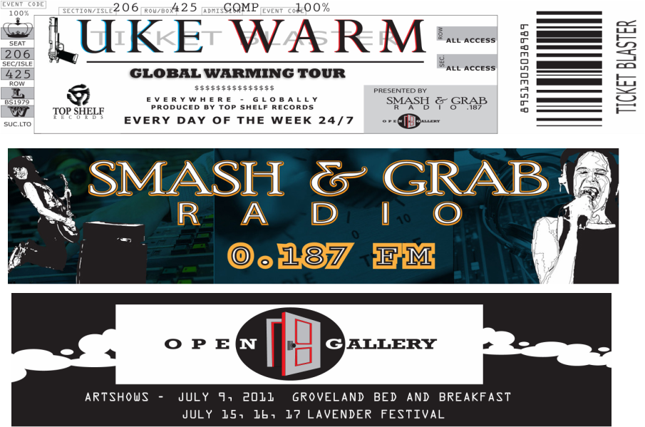
1. I created this logo for the company I work for. It includes an image of a phoenix because that is the owners favorite bird this is a logo that she will be using in the future so it serves two purposes. One for my homework and two, and a new logo for my boss and friend. I chose a simple font that had a bed and breakfast feel because that is what it is.
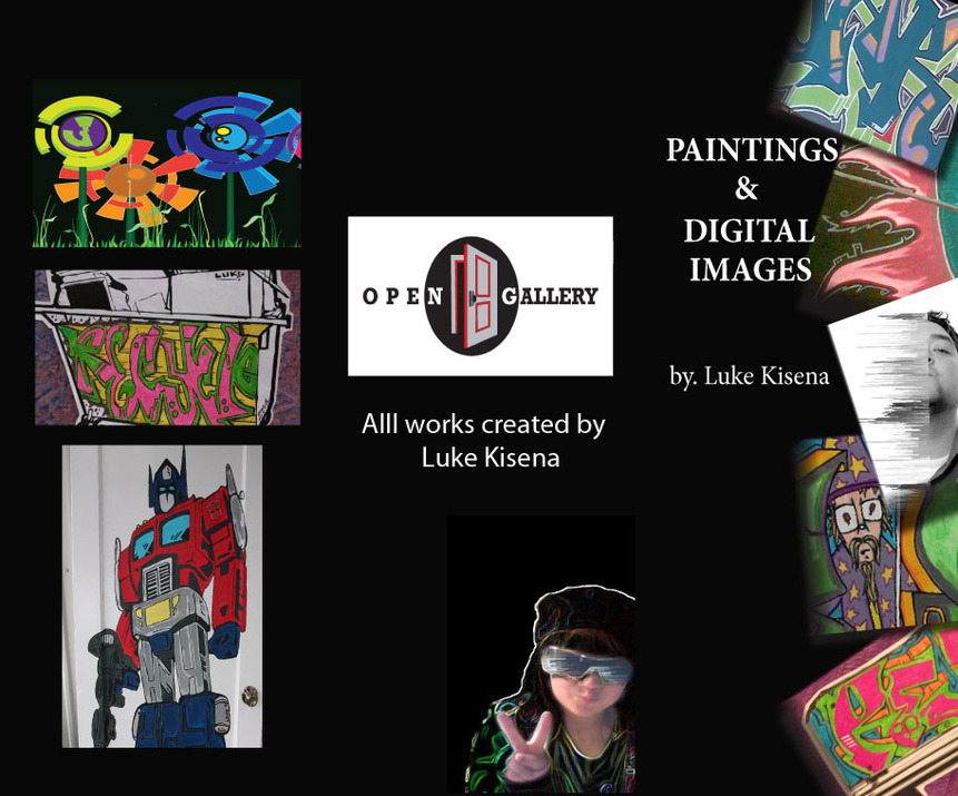
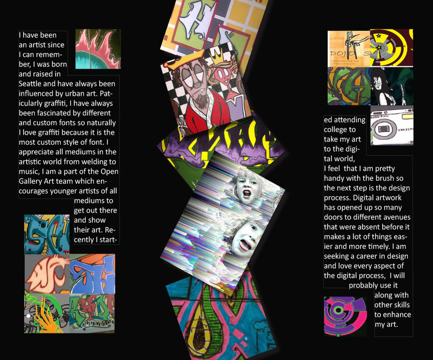
2. The second logo is for me personally, the open gallery is a group of young artists, including myself that focuses on every genre and medium of art. We are open to everybody's work so I thought a open door was fitting. This logo will also be used by the team and me personally. The picture of the door is the image I used to create my own.
The other ones are just for practice.
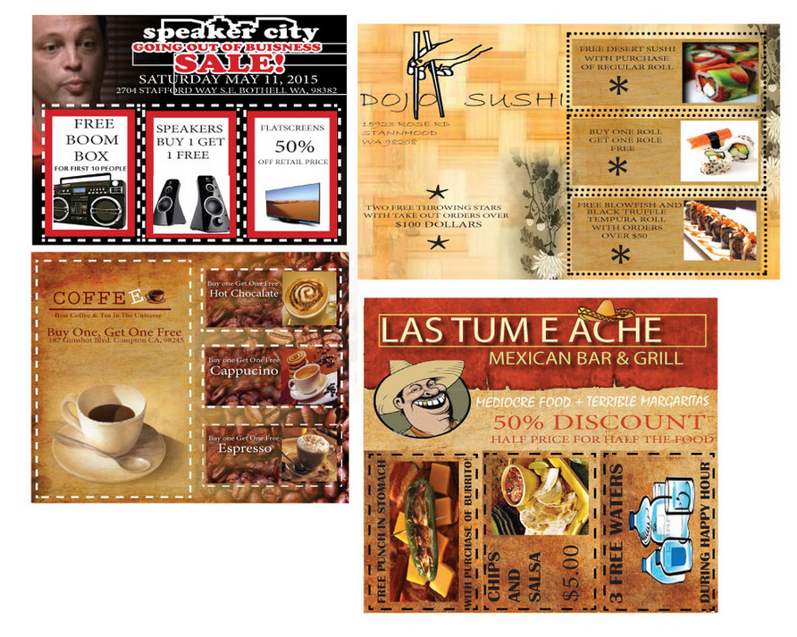
Assignment 8 Media 110
Assignment 9 Media 110
Assignment 10 Media 110
Assignment 11 Media 110